> 2021年06月12日信息消化 ### Typography #### Lesson 2: Equilateral triangle of a perfect paragraph We don’t read letter per letter. We only do that when we’re children and are still learning to read. After that we read word by word. The words that we’ve become familiar with are stored in our brains. So reading is basically recognising shapes of words. Our eyes constantly move left and right in the process of reading. They do that so quickly that we don’t even notice. These eye movements are called saccades. They’re broken up by fixations which usually come at the end of words. After each line of text our eyes get a longer break as we switch focus to the next line in the text. Make these lines too long and the eyes will get tired quicker. Make the spacing between the lines too tight and our eyes will get confused on which line to start reading. 我们不会逐个字母阅读。只有在我们还是孩子,还在学习阅读的时候才会这样做。在那之后,我们逐字阅读。我们已经熟悉的单词都储存在我们的大脑中。因此,阅读基本上就是识别单词的形状。我们的眼睛在阅读的过程中不断地左右移动。它们做得如此之快,以至于我们甚至都没有注意到。这些眼球运动被称为囊状运动。它们被固定所打断,固定通常出现在单词的末尾。在每一行文字之后,我们的眼睛会有一个较长的休息时间,因为我们会将注意力转移到文字的下一行。如果这些行数太长,眼睛就会更快疲劳。如果行与行之间的间距太小,我们的眼睛就会搞不清该从哪一行开始阅读。 ##### The equilateral triangle There are some general best practices in typography but they’re never definite. As we saw with the line-height, we’re commonly presented with ranges that we should use. What to choose from that range takes time to learn. The eye needs time to get sharper in noticing these differences. That’s why it may seem wrong at first when you set your heading to a smaller line-height than the paragraphs, but in time you’ll see that it’s actually correct. And so we come to what I call the Equilateral triangle of a perfect paragraph. We’ve looked at type size, measure and line-height in isolation (as much as we could). By doing so, we already learned that these features are interconnected. They can’t be considered in isolation and they never should be. That’s why an equilateral triangle is a perfect representation of a well designed paragraph of text. For it, we need a good type size that matches the measure, which matches the line height. Get one of them wrong and your triangle will get skewed. ##### 等边三角形 在排版方面有一些一般的最佳做法,但它们从来不是确定的。正如我们所看到的线高,我们通常会被告知我们应该使用的范围。从这个范围中选择什么需要时间来学习。眼睛需要时间才能更敏锐地注意到这些差异。这就是为什么当你把标题设置成比段落更小的线高时,一开始可能看起来是错误的,但随着时间的推移,你会发现这实际上是正确的。 因此,我们来到了我所说的完美段落的等边三角形。我们已经孤立地研究了字体大小、尺寸和行高(尽我们所能)。通过这样做,我们已经了解到这些特征是相互联系的。它们不能被孤立地考虑,也不应该被孤立地考虑。这就是为什么一个等边三角形是一个设计良好的文本段落的完美代表。对它来说,我们需要一个好的字体大小,与尺寸相匹配,与行高相匹配。错了其中的一个,你的三角形就会变得歪斜。 https://betterwebtype.com/triangle #### Lesson 3: Anatomy of a typeface https://us2.campaign-archive.com/?u=d2aaa3155cfda7e76c73817a0&id=8d83786b7a&e=c862f57c2c Typefaces come in all shapes and forms. Serif and sans-serif are the two main groups but each consists of numerous styles. Old style, transitional, neoclassical, slab, clarendon and glyphic for serifed typefaces; grotesque, square, humanistic and geometric for the sans serifs. Exploring these reminds me of space exploration. A vast amount of typefaces, each different from the other, each unique, each special. Just like stars and planets, despite their uniqueness, all typefaces have something in common—their anatomy. No matter how special or unique their style is, all typefaces share most of their main features. Looking at typefaces is just like gazing at the night sky and looking at the stars. Nothing special if you don’t know what you’re looking at but very interesting if you know where to look and recognizing unique features that define the typefaces (or stars). 字体有各种形状和形式。有衬线字体和无衬线字体是两个主要群体,但每一个群体都由众多风格组成。有衬线字体有旧式、过渡式、新古典主义、板块式、克拉伦登式和字形;无衬线字体有怪诞式、方形、人文主义和几何式。探索这些让我想起了太空探索。大量的字体,每一种都不同,每一种都独特,每一种都很特别。就像星星和行星一样,尽管它们具有独特性,但所有的字体都有一些共同点--它们的解剖结构。不管它们的风格有多特别或独特,所有的字体都有其大部分的主要特征。观察字体就像凝视夜空和观察星星一样。如果你不知道你在看什么,那就没什么特别的,但如果你知道从哪里看,并认识到界定字体(或星星)的独特特征,那就非常有趣了。 Figure 17: Anatomy of a typeface  Let’s look at a few main features that will help you gaze the sky a bit better. We don’t need to know all the details so we’ll cover the most basic features. Ascenders and descenders are the most noticeable. They define the shapes of letters and they define the letters themselves. Ascenders are the parts of letters that lie beyond the x-height line and the descenders are the parts that lie below the baseline. Cap height marks the most upper part of the capital letters. Notice that the ascenders go beyond that line. Also notice how some letters go slightly beyond the baseline and the x-height line. Take a look at the “o” and “e” in the figure x. Type designers do that to make the letters optically balanced. A more rounded letter needs to be a bit larger to seem balanced with the other larger and less round letters. 让我们来看看几个主要的功能,这将帮助你更好地凝视天空。我们不需要知道所有的细节,所以我们将涵盖最基本的功能。上升线和下降线是最引人注目的。它们定义了字母的形状,也定义了字母本身。上标是字母中位于X-高度线以外的部分,下标是位于基线以下的部分。上限高度标志着大写字母的最上层部分。请注意,上行线超出了这条线。也注意到有些字母稍微超出了基线和X-高度线。看看图中的 "o "和 "e",字体设计师这样做是为了使字母在视觉上保持平衡。一个更圆的字母需要大一点,以便与其他更大、更不圆的字母看起来平衡。 ### Tips for creating icons and logos in Figma https://uxdesign.cc/tips-for-creating-icons-and-logos-in-figma-c618a5fdc0c4  #### Boolean Groups and Shapes Once you have more than two shapes selected within your frame, you will see an option of Boolean Groups in the top panel. You can create a Frame by pressing **F** on your keyboard. > As you saw above, each time you create a shape, it will have a default light gray color. > To override the default properties of a shape, first create a shape like you normally would. Then, set whatever properties (e.g. Fill, Stroke, etc.) you want on the shape. > Once you’re satisfied, select the shape and go to Edit > Set Default Properties to set the properties. The next time you create any shape, it will preserve these settings. > > 正如你在上面看到的,每次你创建一个形状时,它都会有一个默认的浅灰色。 > 要覆盖一个形状的默认属性,首先像你通常那样创建一个形状。然后,在形状上设置你想要的任何属性(例如,填充、描边等)。 > 一旦你满意了,就选择该形状,然后进入编辑>设置默认属性来设置这些属性。下次你创建任何形状时,它将保留这些设置。  #### Union Selection  #### Subtract Selection  #### Exclude Selection  #### Flattening Shapes As the number of shapes grows, simply relying on booleans can make your icons complex and multi-layered. By flattening booleans, you can simplify your workflow. You can do so by selecting the Flatten Selection option under Boolean Groups to create a new vector and work from there. 随着形状数量的增加,简单地依靠布尔运算会使你的图标变得复杂和多层次。 通过扁平化布尔值,你可以简化你的工作流程。你可以通过选择布尔组下的扁平化选择选项来创建一个新的矢量,然后从那里开始工作。 ##### Create Code Icon - Create a square (shortcut to create a square is **R + Shift + Drag**) - Rotate it by **45 degrees** - Duplicate it (**Command + D**) and shift it a few pixels to the right - Select both shapes and do **Subtract**; then select **Flatten Selection** - Press the **Enter** key to go into edit mode - Now, select the edges and set a corner radius - Duplicate the shape and rotate it by **180 degrees** 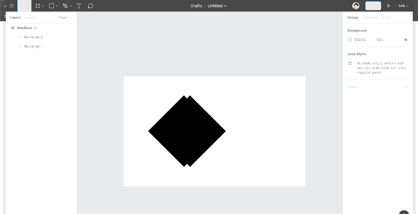 ### UI Grid Best Practices https://blog.prototypr.io/ui-grid-best-practices-efd6c4f9d16  #### Tip 1 — **Choose numbers wisely** While the 12-column Bootstrap like-grid is the most popular choice, it’s not mandatory. When choosing a grid, select the one with a number of columns **your design truly needs**, *no less no more*. #### Tip 2— **Know your constraints** ##### Most common screen resolutions (px) - Desktop: 1440x1024 - Tablet: 768x1024 - Mobile: 320x640 ##### Tip 3 — Horizontal and vertical spacing  ##### Tip 4 — Shape vertical rhythm Use the baseline grid to arrange the content and bring visual consistency to your text and layout elements. **Bonus tip—**Adjust font line height to match the baseline grid. > ***For example:\*** *If you choose 4px as a baseline/grid unit, to align text, you will need to set the line-height of the font to a multiple of the unit, which means the line height should be 4, 12, 32, 64, etc.* ##### Tip 5—Use power of the frame & color Use framing as a tool to focus your user’s attention on a certain layout part. Add additional visual weight in the place where it is needed.  #### Tip 6 —Step out of the grid Put certain elements off the grid. Use this breakdown trick to add value and make certain parts of your design stand out. #### Tip 7— Adapt your grid Ensure your layout is adaptable to common screen sizes, breakpoints and provides a good mobile user experience. Make sure to always check your designs on different screens.  #### Plugins - [Layout grid vizualizer](https://www.figma.com/community/plugin/831003768229656707/Layout-Grid-Visualizer) — Better layout visualization (Figma); - [Grid generator ](https://www.figma.com/community/plugin/841313026689642442/Grids-Generator)— Generate grids in seconds (Figma); - [Guides](http://guides.pratikshah.website/)—Quickly generate guides for a selected element (Sketch); - [Copy/Paste](https://github.com/FrancisVega/sketch-c)—Copy paste layout grids (Sketch). ### 6 UI Concepts That Will Make You a Front End Ninja https://javascript.plainenglish.io/6-ui-concepts-that-makes-you-a-frontend-ninja-c6c0a29fa954 #### 1. Hierarchy is Everything While developing the front end of your application always make sure that you are sticking to a hierarchy, whether it's the ***colors\***, ***font weight, font style\***, etc. Having a good visual hierarchy makes your application look ***less noisy\*** & instead of everything in your interface competing for maximum attention and it’s not clear what matters the most. - As you can observe the amount of noise we have in the given below *dashboard* page, everything looks blended in a single page, and it's not clear where the user should focus at the first visit. 你可以观察到我们在下面给定的*仪表盘*页面中的噪音量,所有东西看起来都混合在一个页面中,而且不清楚用户在第一次访问时应该关注什么。    #### 3. Using Labels  ##### 4. Semantics are Secondary There are times when we have multiple actions on a single page, in such a situation, it’s easy to fall into the trap of designing those actions according to semantics. Most of the time people end up ignoring their hierarchy for semantics. Especially while designing buttons semantics plays a vital role as most pages have one true primary action, less important secondary actions, and few tertiary actions. 有的时候,我们在一个页面上有多个动作,在这种情况下,很容易落入根据语义来设计这些动作的陷阱。 大多数情况下,人们最终会忽略他们的语义层次结构。特别是在设计按钮的时候,语义学起着至关重要的作用,因为大多数页面都有一个真正的主要动作,不太重要的次要动作,以及少数的三级动作。  #### 6. Using Empty Spaces  ### 高可用架构-限流如何实现 [高可用架构-限流如何实现](https://www.v2ex.com/t/783029#reply1) #### Why use 限流? 理论上一个完整的对外提供服务的系统架构在设计初期,就要基于**上游流量**,**流速**,**高峰期时间点**,**峰值 qps**,还有自身系统的**负载能力**,评估系统的**吞吐量**,并且进行入口流量的管制。 当超出限流阈值时,系统可以采取拒绝服务,排队或者引流等机制, 保证自身一直在健康的负载下。 #### 小概念 Review QPS > Queries Per Second (每秒查询率),每秒查询率 QPS 是对一个特定的查询服务器在规定时间内所处理流量多少的衡量标准,在因特网上,作为域名系统服务器的机器的性能经常用每秒查询率来衡量。 RPS > Requests Per Second (每秒发送请求数 /吞吐率),指客户端每秒发出的请求数。阿里云 PTS 对于这个词的解释为 RPS 有些地方也叫做 QPS,在不单独讨论“事务”的情况下可以近似对应到 Loadrunner/jmeter 的 TPS ( Transaction Per Second, 每秒事务数)。 TPS > Transactions Per Second (每秒传输的事物处理个数),即服务器每秒处理的事务数。TPS 一般包括一条消息入和一条消息出,加上一次用户数据库访问。(业务 TPS = CAPS × 每个呼叫平均 TPS ) #### 限流粒度 - 集群限流 - 单机限流 ##### 集群限流 集群限流方式可以归纳为两种 - 网关层 - 应用层 ##### 网关层 网关层常见设计,基于 nginx lua module 实现整体管控。下面是简单 lua demo 。 ```lua local locks = require "resty.lock" local function limiter() -- ngx dict local limiter = ngx.shared.limiter -- limiter lock local lock = locks:new("limiter_lock") local key = gx.var.host..ngx.var.uri -- add lock local elapsed, err =lock:lock("ngx_limiter:"..key) if not elapsed then return fail("failed to acquire the lock: ", err) end -- limit max value local limit = 5 -- current value local current =limiter:get(key) -- 限流 if current ~= nil and current + 1> limit then lock:unlock() return 0 end if current == nil then limiter:set(key, 1, 1) -- 初始化 else limiter:incr(key, 1) -- +1 end lock:unlock() return 1 end ngx.print(limiter()) ``` Nginx.conf ```nginx http { …… lua_shared_dict limiter_lock 10m; lua_shared_dict limiter 10m; } ``` ### ### 一点收获 - 最近在练的tango曲"una por cabeza"吉他版本,meaning "by a head",中译的"一步之遥"很美。 - [50 Very Short Rules for a Good Life From the Stoics](https://forge.medium.com/50-very-short-rules-for-a-good-life-from-the-stoics-871241494571) - You are the product of your habits. - Value time more than money and possessions. - Don’t compare yourself to others. - Learn something from everyone. - The obstacle is the way. - Ego is the enemy. - Stillness is the key. - NFT only represents ownership. - 在AWS EC2使`ping`有效。 - 