> 2021年10月28日信息消化 ### The Project-Driven Life origin: [The Project-Driven Life](https://www.scotthyoung.com/blog/2021/10/26/project-driven-life/) Big goals and plans matter little if they don’t translate into action. ##### What is a Project? I contrast projects with goals. A goal is your desired outcome: - Lose 15 lbs. - Become a millionaire. - Learn French. A project is a plan of action: - Stick to my daily workout for thirty days. - Save and invest 25% of my salary for the next five years. - Get a tutor, buy a textbook and practice speaking weekly. The line between goals and projects can be blurry. The difference is that **goals emphasize outputs while projects emphasize inputs**. A well-designed goal may be easy or impossible depending on circumstances outside of your control. **A well-planned project, however, can nearly always be achieved** because it depends mostly on your own commitment and effort. 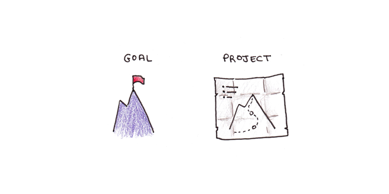 When I wrote my book, [Ultralearning](https://www.scotthyoung.com/blog/ultralearning/), I didn’t focus on sales, external success, or other outcome goals. Whether it was a hit or a flop wasn’t up to me. I focused on what I could control. I had a year to write. I still needed to run my business, spend time with friends and family, exercise and run my life. The project was to write the best book I could within those constraints. ##### Life as a Series of Projects I find the discrete, finite nature of projects to be satisfying. Think about a project for a while, work on it to the best of your ability, and at a certain point, it’s finished. ##### The Life Cycle of a Project My projects go through three phases: incubation, action, and completion. ###### 1. Incubation Incubation is essential. The longer and more ambitious the effort, the more **it pays to choose wisely**. You want to avoid picking poorly thought out projects you won’t actually finish. Spending more time thinking about projects tends to filter out fleeting or bad ideas. When you do act, you’re working on something that has kept your interest for months. This incubation phase tends to work best when it occurs during another project or immediately following one. Those are periods when you generally don’t want to work on anything else, so daydreaming is relatively costless. When I’m itching for a project but don’t have a good one ready, I tend to settle for **short ones—a month at most**. ###### 2. Action Good projects should make you **a little obsessed**. Obviously, you can go overboard, but a good project should make you think about it a bit more than you’d like to. If you can’t get yourself to think about it, even when you’re working on it, reaching the finish line is unlikely. That isn’t to say effort is automatic. Nearly every project I tackle has its low moments: frustration, self-doubt, the feeling that maybe this will end in disaster. You’ll feel the tug of other, seemingly easier, more tractable projects. You’ll want to quit, take a vacation and not worry about it so much. Maybe you’ll feel like it was a big mistake. **In good projects, these moments are fleeting.** Soon enough, you’ll get another breakthrough, some positive feedback or maybe take a weekend off, and the interest will return. ###### 3. Completion Finally, completion. Not all goals can be achieved in a single project, but **all projects must end eventually.** I prefer to define project completion by setting a **timeframe** rather than an arbitrary milestone. Working on something for six months or a year, and trying to do the best I can within those constraints, works better for me than working *until* I achieve a particular goal. Sometimes this framing isn’t possible, but I find **time-constrained projects easier to stick to**. **Finishing a project is a funny feeling.** There’s satisfaction, obviously, for a job well done. But after this immediate glow, there’s not much feeling at all. You rest for awhile, and then comes the itch to begin again. ##### Projects Give Life Depth Projects serve as **landmarks** in the hazy stream of our daily existence and draw out our perception of time. I suspect projects aid in achievement as well. **A project tends to be large enough to allow you to accomplish things that wouldn’t happen automatically on their own.** Perhaps the biggest reason is simply that a project is a reminder that **life is finite.** Oliver Burkeman’s book [Four Thousand Weeks](https://www.amazon.ca/Four-Thousand-Weeks-Management-Mortals/dp/0735232466/ref=sr_1_1?dchild=1&gclid=CjwKCAjwwsmLBhACEiwANq-tXATYVOizTgacrgLfFKhGnqiDtP3x3zNVfTRQOX4C4w5-LoiOkTftThoCqJ8QAvD_BwE&hvadid=506542448803&hvdev=c&hvlocphy=9001551&hvnetw=g&hvqmt=e&hvrand=14019547324985018595&hvtargid=kwd-1142911280872&hydadcr=25834_10174906&keywords=four+thousand+weeks&qid=1634923344&sr=8-1) breaks down a human life into weekly increments. But four thousand is still a hard-to-visualize number. Taking year-long projects as the modal value, claiming that life is around 50 projects puts things into a sharper perspective. What will be yours? #### The start of a new era for Responsive Web Design origin: [The start of a new era for Responsive Web Design](https://uxdesign.cc/the-start-of-a-new-era-for-responsive-web-design-6658a6bbeb9b) ##### How it started — Fixed Screens At the turn of the millennium we first started crafting interfaces in single view screens that made up the popular screen sizes at the time — most likely 640x480.  ##### How it’s going — Responsive Design The concepts of Mobile-first and progressive enhancement became really popular approaches in the early days when mobile phones did not understand media queries or JavaScript yet and there was a lot of CSS that purely just weren’t supported yet. In today’s terms, when we say Responsive Design, we think of a page that adapts its layout to the overall browser, screen size and the limitations projected onto the entire layout. We use media queries to change the whole page layout as we resize the design from a desktop to a mobile size. ##### Where to next — Component Driven We get a lot of powerful tools with [viewport-based media queries](https://webflow.com/blog/responsive-web-design), but we also lack a lot of finesse as this is a one-size-fits-all solution for the whole page and that’s the same for each user. We lack the ability to respond to user needs, as well as the ability to inject responsive styles into components themselves. ##### Users can set preference-based media queries In short, we could expect new preference-based media queries that help us be more responsive to our users. They will give us the ability to style web experiences that align with our user’s own specific preferences or needs. This would allow us to adapt our UX to be specific to a specific user’s experience. In no way is this a complete list, but to give you some ideas, these preference-based media queries could include: ```css @prefers-reduced-motion @prefers-contrast @prefers-reduced-transparency @prefers-color-scheme @inverted-colors ``` Another popular media query is `@prefers-color-scheme` which allows us to change our design to light or dark mode, based on the user's preference and setting in their operating system. This does not rely on a UI switch the user needs to use to change to dark mode, this would just happen automatically. > Preference-based media queries would allow us to adapt our User Experience to be specific to a particular user’s experience. ##### Container queries to inject new life into your design system One of the most exciting emerging areas in CSS is “[container queries](https://developer.mozilla.org/en-US/docs/Web/CSS/CSS_Container_Queries)”, also frequently called “element queries”. It’s hard to understate what the shift from **page-based responsive** design to **container-based responsive** design would do to evolve the design ecosystem. Even though it’s [not safe to use today](https://caniuse.com/css-container-queries), it’s important to understand the shift of where things are going. In a nutshell, container queries would allow us to **set rules based on the parent container**, rather than the overall page. This means that any component is more self-contained, aligned to modern design systems, and truly become plug-and-play modules that could be moved to any page or layout without having to reconsider everything based on its new environment.  #### The Process of Building a CSS Framework origin: [The Process of Building a CSS Framework](https://tympanus.net/codrops/2021/10/25/the-process-of-building-a-css-framework/?ref=sidebar) [Live demo](https://ambercreative.co/codrops/) The original idea was to create a super light CSS framework that would include only a set of global styles (e.g., colors, form elements, and buttons) that we could reuse each time a new component was created.  **We decided to include a few utility classes** into the framework, and it turned out to be super useful not only to dry the components code but also to make them easier to customise. ```html <div class="component margin-y-md padding-y-sm"> <!-- ... --> </div> <div class="component margin-y-xl padding-y-md"> <!-- ... --> </div> ``` **One flaw of this version was the upgrade process:** when a new version of the framework was released, the changes to the base code would be mixed up with the custom code the user had already modified. To fix this issue, in CodyFrame v2 we decided to split the framework into two parts: 1. Basic style – essential CSS rules and utility classes; 2. Custom style – SCSS templates to create your bespoke style. ```plain text css/ ├── base/ │ ├── _accessibility.scss │ ├── _buttons.scss │ ├── _colors.scss │ ├── _forms.scss │ ├── _icons.scss │ ├── _spacing.scss │ ├── _typography.scss │ └── _util.scss └── custom-style/ ├── _buttons.scss ├── _colors.scss ├── _forms.scss ├── _icons.scss ├── _spacing.scss └── _typography.scss ``` ##### CSS Custom Properties CSS variables are great for code maintenance: you define the variable in one place and use it everywhere in your code. If you need to modify its value later, you only need to update one line of code, and it will propagate through the entire codebase. But we picked them (mostly) for a different reason: unlike SASS variables, you can update the value of a CSS variable using a class or media queries. ```css .icon { --size: 1em; height: var(--size); width: var(--size); } .icon--sm { --size: 16px; } ``` ##### Typography ```css SCSS :root { // font family --font-primary: Inter, system-ui, sans-serif; // font size --text-base-size: 1rem; // body font-size --text-scale-ratio: 1.2; // multiplier used to generate the type scale values ???? // line-height --body-line-height: 1.4; --heading-line-height: 1.2; // capital letters - used in combo with the lhCrop mixin --font-primary-capital-letter: 1; // unit - don't modify unless you want to change the typography unit (e.g., from Rem to Em units) --text-unit: var(--text-base-size); // if Em units → --text-unit: 1em; } :root, * { // type scale --text-xs: calc((var(--text-unit) / var(--text-scale-ratio)) / var(--text-scale-ratio)); --text-sm: calc(var(--text-xs) * var(--text-scale-ratio)); --text-md: calc(var(--text-sm) * var(--text-scale-ratio) * var(--text-scale-ratio)); --text-lg: calc(var(--text-md) * var(--text-scale-ratio)); --text-xl: calc(var(--text-lg) * var(--text-scale-ratio)); --text-xxl: calc(var(--text-xl) * var(--text-scale-ratio)); --text-xxxl: calc(var(--text-xxl) * var(--text-scale-ratio)); --text-xxxxl: calc(var(--text-xxxl) * var(--text-scale-ratio)); } @include breakpoint(md) { :root { --text-base-size: 1.25rem; --text-scale-ratio: 1.25; } } body { font-family: var(--font-primary); } h1, h2, h3, h4 { font-family: var(--font-primary); --heading-font-weight: 700; } // font family .font-primary { font-family: var(--font-primary); } ``` ##### CodyFrame in action We can customise the HTML structure of this header: let’s delete the code for the ‘Download’ button item and the divider (`.header__item--divider`) and let’s remove the `aria-current="page"` attribute from the ‘Resources’ link – that attribute is used to style the current page link. In our case, it is the home page, so we won’t need to set it for any of the header links: ```html <header class="header position-relative js-header"> <div class="header__container container max-width-lg"> <div class="header__logo"> <a href="#0"> <svg width="104" height="30" viewBox="0 0 104 30"> <title>Go to homepage</title> <!-- ... --> </svg> </a> </div> <button class="btn btn--subtle header__trigger js-header__trigger" aria-label="Toggle menu" aria-expanded="false" aria-controls="header-nav"> <i class="header__trigger-icon" aria-hidden="true"></i> <span>Menu</span> </button> ``` For the hero section, we’ll be using some of the CodyFrame utility classes. ```html <section class="container max-width-adaptive-md padding-top-xl padding-bottom-xxl"> <h1>Lorem ipsum dolor sit amet consectetur adipisicing elit</h1> <p class="line-height-md margin-y-md">Lorem ipsum dolor ...</p> <div class="flex items-center gap-sm"> <a href="#0" class="btn btn--primary">Download</a> <a href="#0" class="color-inherit">Learn more</a> </div> </section> ``` To animate the headline words, we can use the [Animated Headline](https://codyhouse.co/ds/components/app/animated-headline--clip) component (the ‘clip’ variation). https://codyhouse.co/ds/components/app/animated-headline--clip For the next section, let’s use the [Sticky Hero](https://codyhouse.co/ds/components/app/sticky-hero--scale) component – the ‘scale’ variation – with some minor customisations. #### How an Event-driven Architecture changed the way I design software origin: [How an Event-driven Architecture changed the way I design software](https://medium.com/@davrv93/how-an-event-driven-architecture-changed-the-way-i-design-software-741f397d3055) ### Misc - **Dogfooding**: The term "dogfooding" is an IT slang for the use of one's own products. In some uses, it implies that developers or companies are using their own products to work out bugs, as in beta testing. - **Event-driven Architecture** - Use cases - Email dispatcher - Payment processing - Fraud detection - Background tasks - Subscriptions